Monday, August 31, 2015

Shot Explorer: Parallel Sets


Tennis Matches generate a great deal of data, but the majority of data from Tennis Matches hasn't generally been captured.  Even with Hawkeye, at the elite level, what can be done with tennis data is still relatively uncharted territory. Witness the work being done by Damian Saunder at GameSetMap.com; cutting edge. In a very real sense we are still at the beginning of the era of the application of "knowledge discovery" tools to tennis data.  As Jeff Sackmann says in his 2015 presentation at the MIT Sloan Sports Analytics Conference, "Tennis lags behind pretty much every other sport..." when it comes to what he calls "Actionable Analytics".

At the base of every tennis statistic there are Shots; many Shots. And every shot has a multitude of attributes that can be captured.

When I started my Tennis Analytics Integration Platform (AiP) project I was eager to try as many D3 visualizations as possible.  Immediately after figuring out how to use the Sunburst chart to create a compact visualization of the Sets, Games, Points and Shots of a Tennis Match, I turned to the Sankey Diagram to try to build a visual filter for selecting Shots to display on a graphic representation of a Tennis Court.  I was inspired by the Shot depiction capabilities of ProTracker Tennis. My goal was to build a tool that didn't require checkboxes and which enabled every shot to be seen at once.

Here is the result of my first attempt, using the D3 Sankey plugin and Sankey example created by Mike Bostock.
Sankey diagrams are typically used to represent "flows" within a system.  A quantity of something is depicted as flowing or passing through a series of stages; at each stage there is a transformation and new categories emerge; as new categories emerge, quantities are divided between them; it is also possible for categories to emerge that recombine quantities.

When applied to the attributes of Shots within a Tennis Match, each attribute becomes a stage where a quantity of Shots is divided or combined; each attribute value becomes a category.  In the Sankey diagram above, the attributes from left to right are "Stroke", "Stroke Type", "Trajectory", "Result" and "Endpoint".  Hovering over a flow between any two attribute categories reveals the number of Shots within that flow; in other words, which Shots share those two attribute values.

I was quite excited by this early visualization, but it turned out that the re-combining of quantities made it impossible to follow a single Shot as it passed through each stage.  In other words, at any one time I was only able to generate a collection of shots that shared the values of two attributes. What was really needed was a way to generate a collection of shots that had the same value for an arbitrary number of attributes.  For instance, I wanted to be able to see all Second Serves that were "down the line" or "to the T" Service Winners, or all Backhand CrossCourt Drives that ended in the Net.

Parallel Sets ended up providing me with one possible answer. Parallel Sets were developed circa 2005 by Robert Kosara, Fabian Bendix and Helwig Hauser (see here and here) as a method of visualizing Categorical data.  Parallel Sets "divide the flow path" at each stage/attribute; while flows do pass through subsequent stages together, they do not re-combine.

In the parlance of Parallel Sets, each Tennis Shot attribute becomes a "dimension" and each possible attribute value becomes a "category".  The dimension "Stroke Type", for example, has the categories "Drive", "Slice", "Lob", "Drop Shot", "Smash", "First Serve" and "Second Serve". Now, admittedly, this looks like a mess of multi-colored spaghetti.  Some of the categories have so few Shots in them that they are too narrow to read.  Thankfully, each flow or "ribbon" is highlighted as the mouse hovers over it, and a helpful tooltip appears to list each attribute value which applies to the region of the ribbon, between two dimensions, where the mouse is hovering.  In the screenshot above the mouse is hovering over a region between Stroke and Stroke Type where the categories are "Serve" and "First Serve".  Seventy-one shots match this criteria, which is 79% of all Serves by one player during the match.

The Parallel Sets image above is from the 2015 Western & Southern Open Final between Serena Williams and Simona Halep.  You can explore this match yourself here.  (Click on either player's name to reveal the Parallel Sets diagram).

The Seventy-one "First Serves" mentioned above are 79% of all Serves by Simona Halep, but this isn't a useful statistic.  The real power of the Parallel Sets diagram can be seen by dragging dimensions vertically and categories horizontally to interactively explore the data. By reorganizing the dimensions, in this instance dragging "Stroke Type" to the top of the diagram, it is possible to see that of all "First Serves", 20% were "Serve Winners", 3% were "Aces" and 51% were "In", which totals to 74% (due to rounding the First Serve Percentage given in the Statistics is 73%).

Any number of other statistics can be derived using the above method, but this wan't the original inspiration for making a Parallel Sets diagram part of TAVA.  TAVA began with data from ProTracker Tennis and the Parallel Sets "Shot Explorer" initially enabled the visualization of shot placement on a graphic representation of a tennis court:
In the first court the selection is: "Serve" > "First Serve"; In the middle court: "Serve" > "First Serve" > "In" > "Cross Court" > "Ad Service Box"; In the last court: "Forehand" > "Drive".

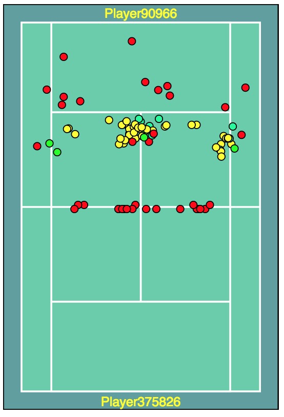
ProTracker Tennis captures coordinate data for first and second serves, the return of serve, and the final "Key Shot" which ends a point, making court visualization possible.  When I added support for matches captured by the Match Charting Project (MCP) I initially questioned the value of the Parallel Sets visualization; MCP data includes a great deal more shot detail, but it doesn't include shot coordinates, and only a rough estimation of shot placement can be derived (more about this in a future post). But recently I was inspired to connect the Parallel Sets "Shot Explorer" visualization with the Points-to-Set graphic via "Point Highlighting". The result is that when a collection of shots is selected in the "Shot Explorer" it is possible to view when during a match those shots occurred.
In this instance I selected the only two double faults made by Serena during the 2015 Western & Southern Open Final.  I discovered that they were made during the same Game during the Second Set, and that Serena won the game anyway.
I have a few more ideas about how the value of the "Shot Explorer" can be enhanced in the future, particularly once a few more visualizations and control structures are added to TAVA.

In Summary, Parallel Sets are a useful frequency-based representation of data.  Tennis Matches generate a large, complex data set, and most of it is not amenable to time-series analysis.  Using a frequency-based visualization in combination with time-series views makes it possible to create collections of data elements (Shots) and visualize their distribution throughout a Tennis Match.


Wednesday, August 19, 2015

Match Radar


The graphic above is a “Match Radar” chart of the 2007 Wimbledon Final between Rodger Federer and RafaelNadal [TAVA link].

The Match Radar is intended to provide a compact visual comparison of the key statistics for players of a tennis match. This is in contrast to the Points-to-Set, Horizon and Radial Horizon charts which aim to depict the dynamics of a match with respect to the scoring of each set.

The Match Radar enables a quick assessment of whether and how one player dominated another, whether a match was lob-sided, and where players differed on key statistics.  It is not intended as a tool for in-depth analysis.

In the match shown above you can see that Federer (blue) and Nadal (purple) were very close in terms of 1st and 2nd serve statistics, with Federer having only a very slightly higher 1st serve percentage and percentage of 2nd serve points won. Similarly, both players were very close on percentage of return points won for both 1st and 2nd serves, with Federer again having only slightly better numbers. Where Federer really stood out was in Aces, Serve Winners, Percentage of Returns-in-play and Forcing Errors. Nadal had more outright winners and more breakpoints, but he failed to convert on enough of the breakpoints to win the match; there was only a difference of seven points at the end of the match.

In the current version of TAVA, the Match Radar appears as both a dashboard icon, with no legend, and a full-size chart; in both cases the graphic is interactive. Values appear in a “tooltip” when the mouse hovers over any point on the chart.
Here is a Match Radar for the 2013 US Open Final between Victoria Azarenka (blue) and Serena Williams (purple); Williams won 5-7, 7-6, 6-1. [TAVA link].

I made a number of changes to the Radar Chart examples found in the various D3Galleries (here and here). You will find a recent D3 Example here. The most notable addition I made to the Radar Chart is the adoption of support for diverse types of axes. This addition was inspired by “Parallel Coordinates” charts, which you can read about here and here.  You can find examples of Parallel Coordinates charts in the current version of TAVA.  I haven't spent a great deal of time trying to optimize their use, but they do seem to be unwieldy; at a size where the labels could be read and the various matches being charted could be discerned I found it necessary to make the graphic horizontally scrollable.

In the Match Radar chart, the majority of the statistics are given as percentages, but there are some statistics (aces, serve winners, winners, forcing errors, and breakpoints) which are given as “extents” where the axes ranges from zero to the maximum value achieved by either player.

I have also modified the standard Radar Chart to support inverted axes, where the high value appears at the center of the Radar with the low value on the outer edge. This can be used to depict Unforced Errors or Double Faults, where the low value is deemed “better” and should enlarge the player's color area of the radar, rather than pull it toward the center. Additionally, the Match Radar supports “bounded extents” where the extent values can be set arbitrarily. This is appropriate when displaying Aggressive Margins, for instance, when values can range either side of zero.

In a future version of TAVA I plan to make the Match Radar “dynamic” such that it can support the real-time display of a selection of points (“brushing” a range of points on the Horizon Chart, for instance); this capability would also make it possible to “Play” the match from the beginning and watch the changes in the shapes of each player's radar as the match progresses.

I also plan to enable users to configure their own views, selecting which statistics are most relevant for their purposes, and in which order they should appear. I haven't yet decided which statistics should appear as the default, and which order makes the most sense.


This is a selection of matches played by Novak Djokovic (blue). Once you are familiar with the layout of the axes on the Match Radar, you can begin to compare matches and to look for patterns. You might want to look for matches that appear very unbalanced, or very close, for instance.

The match below is the 2013 US Open Semifinal between Novak Djokovic and Stan Wawrinka. [TAVA link]. You can see iconic representation of this match in the bottom row above (2nd from right).
The right side of the radar is dedicated to service statistics, while the left ranges from Returns-in-Play and Return Points Won (at the bottom) to Winners, Forcing Errors and Breakpoints (at the top). Djokovic won this match 2-6, 7-6, 3-6, 6-3, 6-4, so it was indeed close.

The Match Radar can also be used to quickly look for changes in key statistics across sets:
This may give an idea of how the “brushing” will work: dragging across a range of points in the horizon chart (below the Points-to-Set chart), would dynamically update the Match Radar to reflect the statistics for the selected range of points. A number of coaches have asked to be able to identify those moments in a match when a specific statistic changed dramatically... I'm not sure how that will surface, as yet, but these “discovery” tools may aid in the development of new ideas.

Going forward I also want to use the selection of statistics chosen for the Match Radar to drive views of a player's statistics across a series of matches, within a tournament, or within an arbitrary date range.  These views would not employ the Match Radar.

Radar Charts have often been critiqued, along with other polar coordinate charts (see here and here). I understand these critiques and, for the most part, agree with them; nevertheless, I find the iconic version of the Radar Chart gives a good "at-a-glance" gut feel for how players differed on key statistics, particularly after spending time looking at a large number of matches and becoming familiar with how to interpret the layout. The Match Radar is far more compact than the alternatives when quickly comparing matches or sets and can serve as a control structure to drive other, more in-depth, analysis tools and visualizations.

I think a significant difference in the application of the Match Radar Chart in the TAVA application is that it is a standard visualization that can be used across potentially thousands of matches (I now have approximately 3000 matches in the Tennis AiP database), as opposed to a one-off article by a journalist or researcher where a novel analysis is being presented.

I'm on the lookout for compact alternatives to the Match Radar Chart, but I believe it will persist in future versions of TAVA.  It is likely the Match Radar will become more of a control structure that drives a variety of complementary "drill-down" visualizations.

Thursday, August 13, 2015

Radial Horizon Graphs: An Original?!?

The logical conclusion to my exploration of Horizon and Corona Graphs.  I've searched and can find no other examples on the "internets" of a radial Horizon Graph, so perhaps this is a first!

For your viewing pleasure, here are ten matches from Grand Slam Finals.  I hope the Radial Horizon Graphs have captured something of the dynamics of the matches that you wouldn't otherwise see when glancing at the score. I've provided a brief (unprofessional) "reading" of each graph, making the (perhaps unwarranted) assumption that there are more winners and forced errors being made than unforced errors.  In the next version of this graphic, or in the interactive version for TAVA, changes in momentum due to winners and losers should be easily discerned.


LEFT: Apart from the first few games of the first set, Kvitova dominated Bouchard.
RIGHT: Hingis was dominating until near the end of the 2nd set; Capriati had a strong finish.


LEFT: Navratilova and Evert were neck-and-neck in the first two sets; Martina dominated in the beginning of the 3rd, but Evert clawed her way back and took the lead at the very end, then lost.
RIGHT: Muguruza took an early lead but lost momentum; she began to recover near the end of the 2nd set, but it was too late.


LEFT: Safina was stronger at the beginning of both sets.
RIGHT: Sharapova was strong at the beginning of the 1st set; she lost ground steadily in the 2nd.


LEFT: Na Li almost gave up her early lead in the 1st set; she never looked back in the 2nd.
RIGHT: Notice that all three sets ended at 6-3; there are differences, but Cilic steadily advanced.


LEFT: Federer began and ended in control; Roddick lead throughout the 2nd set; the 3rd set was a bit of a seesaw, but Federer held; the 4th was definitive.
RIGHT: Wozniacki had a chance to break in the 1st game of the 1st set; after that point she couldn't win points fast enough to keep up with Serena.

Wednesday, August 12, 2015

Points-to-Set: Horizon Corona


I've been searching for a representation of a tennis match that captures the dynamics of play yet remains simple enough and compact enough to use as either an icon or a control structure suitable for selecting a range of points within a match.  I also wanted a graphic that could be used to quickly compare a series of matches, with enough detail to easily differentiate a 6-0, 6-0 win that was a "cakewalk" from a 6-0, 6-0 win where every game went to deuce and beyond.

The Corona/Horizon Graphs above are the result of my early attempts to use Points-to-Set data in a new way, charting the difference between the two players' Points-to-Set numbers rather than the absolute values.

Corona Graphs

Corona graphs are actually formally known as radial area graphs; there are also examples of radial histograms which I would describe as "Corona Graphs". These graphs share a lot in common with Polar Coordinate Graphs (such as TAVA's Radar Chart), but they look like the Corona that surrounds our Sun.  I haven't seen the name used in the Visualization community as yet, but it is fitting, especially considering the formal definition of a Coronagraph: "A coronagraph is a telescope that can see things very close to the Sun. It uses a disk to block the Sun's bright surface, revealing the faint solar corona, stars, planets and sungrazing comets. In other words, a coronagraph produces an artificial solar eclipse".  So, with Corona Graphs I hope to highlight important aspects of a match which normally are obscured by the quantity of data available within the match.

[Update: The term "Corona Charts" (here and here) is used in the financial community.  But it is not a radial structure and doesn't resemble the graphs above.]

Horizon Graphs / Charts

Horizon graphs are a type of Time-Series graph which were developed relatively recently by Panopticon Software (now known as DataWatch).  Here is a paper describing the development of the graph, and here is an in-depth analysis of the Horizon Graph by Stephen Few of Perceptual Edge, a "Visual Business Intelligence" company.

Horizon Graphs excel at displaying a large number of time series at one time.  They are described as a tool for rapidly scanning huge amounts of data to quickly identify "points of concern"; they "preserve data density while preserving resolution."  A Tennis Match can certainly be thought of as a time series, a progression of points through time.  Horizon Graphs seem ideally suited for comparing matches, but it turns out they are also useful for comparing Sets within matches, and for identifying critical moments during play.

When I began this project I was overwhelmed by the variety of chart examples available.  I wanted to try them all, but it wasn't immediately obvious how each type of chart could be meaningfully applied. It wasn't until I generated my first Corona graphs with Point-to-Set data that I realized how I could use Horizon Graphs, and how useful they could be.

Here is the progression from my first Match Corona visualization to my first Match Horizon:


In the first Corona graph, on the left, the difference in Points-to-Set values varies from positive to negative.  For the second Corona graph I simply flipped the negative values and changed the color to represent the second player.  Below you can see the same data values in a standard horizon graph.


The horizon graph is then cut into bands and layered.  The peaks are still visible and no space "under the curves" is wasted.  Color gradations indicate distance from the baseline so that the greater values become darker.


With this realization it became possible to compare sets and matches with a very compact visual.

When you see a Horizon Graph for the first time you might find it to be somewhat confusing.  But with a bit of study and experience I think you'll find them very valuable.  Read the links above or this in-depth overview by a team at Berkeley: "Sizing the Horizon: The Effects of Chart Size and Layering on the Graphical Perception of Time Series Visualizations".

Set Comparison

Here are the sets from the 2001 R16 match at Wimbledon between Pete Sampras and Roger Federer. Federer won the match 7-6, 5-7, 6-4, 6-7, 7-5.  Federer is in blue; Sampras is in Green.  


You can see the winner of each set by the final color of each graph.  The depth of color at any given moment indicates the distance between the two Points-to-Set numbers: darker colors indicate a greater point difference. Turning the graphic into a control structure will enable point and game selection as well as "brushing" to select a range of points in a game. For the next version of TAVA I will add ticks and marks to optionally indicate breakpoints, aces, winners, errors & etc.  I'll save the use of Horizon and Corona graphs as control structures for a future post.  

To illustrate the ability of the Horizon Graph to enable rapid differentiation of sets which have the same score in games but which vary widely in the intensity of play and the distribution of points, here are Horizon Graph for three sets which each finished at 6-0:


In the first example one player dominated completely, winning all points.  In the second example, which is taken from the 2012 Olympics final between Serena Williams and Maria Sharapova, Serena gave up 12 points to Sharapova and needed 28 points to close out the set.  In the third example every game of the set went to deuce and most games were at deuce more than once. Seventy-one points were played in the final example versus only twenty-four in the first example and forty in the second.

Match Comparisons

The screen real-estate provided by Blogger makes these a bit too compact, but I hope this gives some idea of the expressiveness of Horizon Graphs.  You can click on each graph to see the full size image:


And finally, here is a link to a video about Interactive Horizon Graphs.  This is a bit orthogonal to my intent to use Horizon Graphs as control structures, but it is interesting nevertheless and may provide some inspiration for a way to compare very large numbers of matches in the future.  I'm discovering that there are many attributes of matches other than Points-to-Set which may be usefully visualized with Horizon Graphs.

Acknowledgements

I want to recognize again the work of Francis X. DieboldGlenn Rudebusch and Professor Diebold's students at the University of Pennsylvania.  As far as I and they can tell, their work on the concept of Points-To-Set is completely original.

Thursday, August 6, 2015

Visualizing Momentum

Momentum has been described as an "invisible" or "hidden force" in tennis.  (See "The Hidden Force" and the NYT article "The Importance of Momentum in Tennis").  Whether momentum actually exists at all in Tennis or any other sport has long been debated, but it is a certainly that momentum is something that many players and even the crowd "feels" when watching a match.

In "Analyzing Wimbledon", Professors Klaassen and Magnus conclude via statistical analysis that some limited momentum exists for weaker players, but not for top players.

While it is impossible to fully capture the emotional and physical dynamics that contribute to changes in momentum, whether it exists or not, it is possible to create a representation of the progression of points throughout a match which includes details relevant to the outcome of each point.

The following graphic captures the outcome of first and second serves, the return of serve, the Key Shot which determines a point winner, as well as the length of the rally, if any, while a point is being played.  The centerline which runs down the middle of the graphic represents an even point score and the line moves left or right depending on which player has won the most points; a standard score-matrix is overlaid to give an understanding of the outcome of each game.

For a full explanation of how to read this graphic, please see my post on the GameFish, which was derived from the Momentum Chart.


Winning the most points does not, however, insure that a player will win a match.  Psychological factors aside, in certain cases when a point is won is more important than the fact that a point was won, at least with respect to the match outcome.  I will discuss this in a future post and hopefully have some visuals which can facilitate better understanding this point.  At the moment I'm working on a graphic that merges the basis of the Momentum Chart (difference in total points) with idea of the "Points-to-Set" graph (number of points required to win, at any given moment) and I'm hoping it will provide some insight.

The Momentum Chart in TAVA was inspired by the excellent Momentum Chart in the ProTracker Tennis App (for iPhones/iPads).  ProTracker Tennis has a few features which I didn't incorporate in my Proof-of-Concept version.  The score-matrix overlay is original to my implementation.

Version 2 of TAVA will increase the use of the Momentum Chart as a control structure and seek to overlay visualizations which provide additional analysis into factors which may be seen to have an influence on changes in momentum.  At the moment the Momentum Chart drives the Court View (post forthcoming) which displays shots for matches captured with ProTracker Tennis.

There is an excellent discussion of Momentum for Players and Coaches on the Turbo Tennis blog at The Tennis Server.  Please see the articles "Momentum... Swing it in your favor",  "Momentum Revisited" and "The Big MO!".

Of course, Momentum can also be interpreted in the context of a series of matches.  The cross-match visualizations I'm doing for the next version of TAVA will look at this aspect of Momentum in depth.

Monday, August 3, 2015

Points-To-Set

The "Points-to-Set" graph was inspired by the work of Francis X. DieboldGlenn Rudebusch and Professor Diebold's students at the University of Pennsylvania.  In December, 2014, Professor Diebold published "A Tennis Match Graphic" on his blog No Hesitations, and in February when I was just discovering D3 I decided to attempt to recreate his work for the data I had just learned to parse from ProTracker Tennis.  Here is the result of that effort, taken from the 2015 Wimbledon semifinal match between Roger Federer and Andy Murray, where you can view these charts "live":


And here is the latest version:


We can think of the "Points-to-Set" number as the minimum distance from the current number of points won until the end of the Set; it always assumes your opponent wins no additional points.  In TAVA this number is expressed graphically for each player to indicate at any given moment in a Set which player is closer to winning.


To win a standard Set in a tennis match a player must, at a minimum, win six games and be ahead by two games.  Giving no more than two points away, there is a minimum of four points which must be won in each game.  That means that at the beginning of a Set each player needs twenty-four points to win the Set.  The Y-axis of the graph below ranges from 24 up to 0, which is where the Set concludes. The X-axis shows the total number of points within the Set.  In the match depicted in these "Points-to-Set" visualizations you can see the varying number of points which had to be played for Roger Federer to close out each Set.

Every point won brings a player closer to the end of the Set, obviously.  Some games, when they are lost, increase the "Points-to-Set" number.  For instance, at the beginning of a Game when the score is 5-4 in the Set, the first player needs only four points to win, while the second requires twelve.  If the first player loses the game and the score becomes tied at 5-5, each player is then eight points from winning the Set. In fact this scenario occurred twice in this match, in both the first and second Sets which were won by Federer 7-5.  You may also notice that in the first game of both the second and third Sets there was a moment when Andy Murray needed 25 points to win the Set.  This actually occurs quite frequently when the first few games are won by one player.  When a player leads 5-0, the opponent actually needs 28 points to win the set.

In the second Set the game which Federer lost there were seven deuces; you can see this in the "Points-to-Set" graphic below where the lines for both players become jagged. You can also see that Federer failed to convert on six breakpoints before winning the set by finally converting a breakpoint.


As I work on the re-write of TAVA I'm developing a gallery of re-usable visualization components and adding configurable features.  In addition to the "orientation highlighting" demonstrated above, I'm adding "game highlighting", which you can see in the chart for the third set below:


When using the "Points-to-Set" component in TAVA, the corresponding moments of the match are highlighted on the Sunburst and you can see the longest game of the match occurred in the second set and was won by Andy Murray (purple) when Federer failed to convert two breakpoints.


In a recent postProfessor Diebold has updated his Tennis Graphic to include elements which indicate where breakpoints occurred and highlight when tiebreaks take place.  Here is the site where his team has collected the visualizations they've created.  I've taken some of these ideas on board and in the re-write of TAVA I'm going to try to push the features and usefulness of the "Points-to-Set" graphic further.  I am intrigued by the idea of producing some variation of a Points-to-Match graphic as a slider/filter for generating dynamic statistics for a range of points within a match...